Waymo
Waymo
Improving the transit experience with
a smart card management app
Improving the transit experience with
a smart card management app
Improving the transit experience with
a smart card management app
A transit app concept for Metro Vancouver. Waymo solves everyday issues like checking your balance, reloading, and paying for rides. Everything’s in one place, designed to make commuting smoother and less stressful.
A transit app concept for Metro Vancouver. Waymo solves everyday issues like checking your balance, reloading, and paying for rides. Everything’s in one place, designed to make commuting smoother and less stressful.
Duration
Duration
6 weeks
My Role
My Role
User research, Branding, Wireframing,
UI Design, Prototyping
Tools
Tools
Figma
Defining the Problem
WHY I DESIGNED THIS
As someone who used to rely on public transit in Vancouver, I always wished there was a simple app to manage your Compass Card. Losing it, forgetting to reload, or hitting a negative balance after boarding was way too common, that’s what sparked the idea for Waymo.
As someone who used to rely on public transit in Vancouver, I always wished there was a simple app to manage your Compass Card. Losing it, forgetting to reload, or hitting a negative balance after boarding was way too common, that’s what sparked the idea for Waymo.
As someone who used to rely on public transit in Vancouver, I always wished there was a simple app to manage your Compass Card. Losing it, forgetting to reload, or hitting a negative balance after boarding was way too common, that’s what sparked the idea for Waymo.
PROBLEM STATEMENT
Transit riders in Metro Vancouver need a simpler, more accessible way to manage their smart cards in one place.
Transit riders in Metro Vancouver need a simpler, more accessible way to manage their smart cards in one place.
PROJECT SCOPE
I followed the four stages of Discover, Define, Develop, and Deliver to guide my process and bring the concept to life.
I followed the four stages of Discover, Define, Develop, and Deliver to guide my process and bring the concept to life.

Research
To understand user needs, I interviewed 6 public transit users (teens to young adults).
To understand user needs, I interviewed 6 public transit users (teens to young adults).
I ASKED QUESTIONS ABOUT:
Their experience with the transit card system
How they learned to navigate the system
Their main issues with the transit card
Their thoughts on a digital version of the card
Their experience with the transit card system
How they learned to navigate the system
Their main issues with the transit card
Their thoughts on a digital version of the card
Here's what I found:
Here's what I found:
01
How people got their transit cards
How people got their transit cards
Some picked them up from local stores or SkyTrain stations, People relied on word of mouth to figure it out but the information wasn’t obvious upfront.
Some picked them up from local stores or SkyTrain stations, People relied on word of mouth to figure it out but the information wasn’t obvious upfront.
02
New users felt overwhelmed
New users felt overwhelmed
Most new users didn’t know about features like autoload or online top-up at first. Learning everything on their own felt overwhelming at first.
Most new users didn’t know about features like autoload or online top-up at first. Learning everything on their own felt overwhelming at first.
03
Frustrating to manage balance
Frustrating to manage balance
Without Wi-Fi or data, checking balance was hard. Reloads didn’t show up right away, making trip planning stressful.
Without Wi-Fi or data, checking balance was hard. Reloads didn’t show up right away, making trip planning stressful.
Verbatim Quotes
Verbatim Quotes

User Journey
User Journey

Product Use Case
Product Use Case

Based on the research and patterns I observed, I created a persona to represent a typical transit card user: Cameron.
Based on the research and patterns I observed, I created a persona to represent a typical transit card user: Cameron.

Design Opportunity
Using insights (especially from Cameron, a key persona), I focused on solving everyday pain points such as balance checks and real-time updates through clear, practical UI.
Using insights (especially from Cameron, a key persona), I focused on solving everyday pain points such as balance checks and real-time updates through clear, practical UI.
What Users Struggled With
How Waymo Can Help
Couldn't check balance or recent trips easily, especially in real-time
Couldn't check balance or recent trips easily, especially in real-time
In-app balance view + trip history with real-time updates
In-app balance view + trip history with real-time updates

Reloading card was slow or inconvenient
Reloading card was slow or inconvenient
Auto-reload setup and easy top-up in the app
Auto-reload setup and easy top-up
in the app
Auto-reload setup and easy top-up
in the app

Managing multiple cards was messy
Managing multiple cards was messy
Manage multiple cards in one place
Manage multiple cards in one place

Forgot their physical card or had trouble finding it
Forgot their physical card or had trouble finding it
Tap-to-pay with phone using Apple Wallet or Google Wallet
Tap-to-pay with phone using Apple Wallet or Google Wallet

Visual Direction
Colour
Colour

Typography
Typography

Final Product
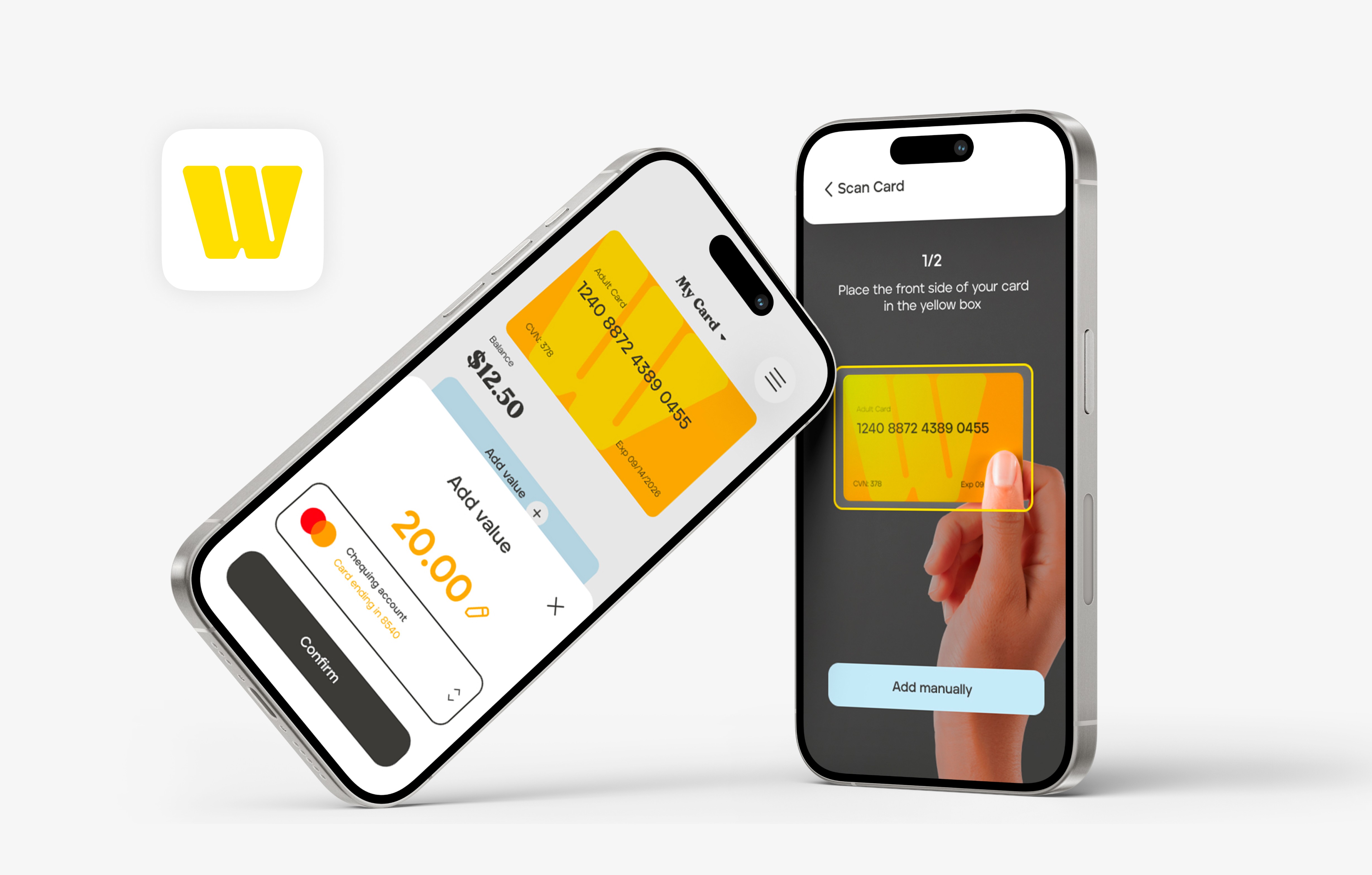
Getting Started with Waymo
Getting Started with Waymo
Enter card info manually or scan with phone
Option to log in with existing account
Enter card info manually or scan with phone
Option to log in with existing account
Your Cards and Activity
Your Cards and Activity
Manage multiple cards + view transit + top-up history
Quick access to settings + support
Manage multiple cards + view transit + top-up history
Quick access to settings + support
Tap & Add Value
Tap & Add Value
Reload card with saved payment methods
Tap-to-pay via phone (future integration with Apple/Google Wallet)
Reload card with saved payment methods
Tap-to-pay via phone (future integration with Apple/Google Wallet)


Takeaway
I learned that meaningful ideas often come from small, everyday frustrations.
I learned that meaningful ideas often come from small, everyday frustrations.
This project reminded me that the problems we deal with daily can lead to useful, thoughtful design
Letting go of perfection helped me focus on progress + learning
This project reminded me that the problems we deal with daily can lead to useful, thoughtful design
Letting go of perfection helped me focus on progress + learning
This project reminded me that the problems we deal with daily can lead to useful, thoughtful design
Letting go of perfection helped me focus on progress + learning
Next Steps
There’s more work to be done to make Waymo inclusive for all kinds of users.
There’s more work to be done to make Waymo inclusive for all kinds of users.
Test with a broader range of users (e.g. seniors, people with disabilities)
Make accessibility + inclusivity a bigger focus moving forward
Test with a broader range of users (e.g. seniors, people with disabilities)
Make accessibility + inclusivity a bigger focus moving forward
Next Project
Next Project
Next Project
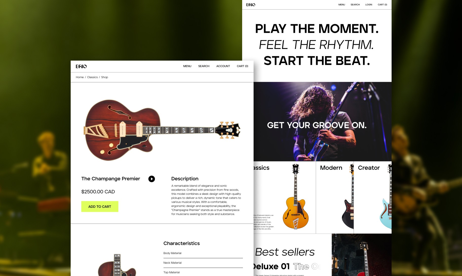
Brio
Brio
Online store for young guitar enthusiasts
Online store for young guitar enthusiasts